
03 February 2015
Writing a responsive site by hand using Chrome as an IDE
So I recently started this blog and just picked a simple Jekyll theme which I just presumed would be responsive, but it turns out it is unreadable on mobile. So I decided I would attempt to just re-write the CSS.
One of my goals with this blog is to keep it as simple as possible. I don’t want to bother with any client-side build scripts, including things like CSS pre-processors. I also didn’t want to include something like Twitter Bootstrap as I don’t want to have thousands of unused selectors that I don’t understand. How hard can writing CSS be, anyway?
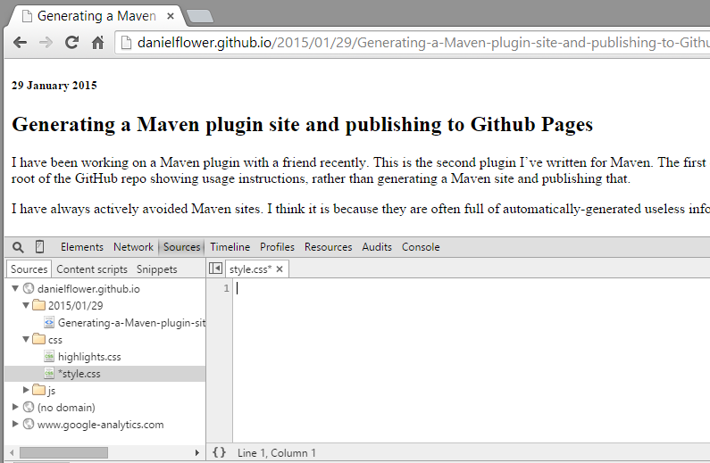
Besides, I wanted to try using Chrome as a development environment. So the first step was loading the website, opening the Sources tab, opening the style-sheet, and just deleting the contents of it. The website immediately lost all its styles, giving me a nice, blank canvas to work with:
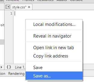
Before doing anything, I wanted to link the stylesheet I was about to recreate in Chrome to a local file on my hard disk so that I wouldn’t lose my work everytime I hit refresh (not that I should need to hit refresh during development - which is one of the nice things about developing directly in the browser). To do this, you simply right click in the CSS file and click “Save as…”
Now I was ready to start coding.
Mobile first
The first thing I did was enable the responsive mode in Chrome and selected iPhone 6 as that is quite a nice size to start with.
Then I started cheating.
I still had the original site open in another window, and so to regenerate a lot of the CSS for things like headings and paragraphs, I just inspected the element and then copied the computed styles into my new clean stylesheet. I very quickly had a lot of the styles already done, but immediately started seeing the non-responsive aspects of the website.
The main issues were around font sizes and having the widths of things specified with absolute values.
So I just went through and did a few things:
- Moved common things like some of the font styling and colours to a
bodytag - Converted headers to use viewport units so that they scale according to the screen size
- Set the widths of all block elements to 100%
At this stage, the website was quite readable at the iPhone 6 stage, even without any attempt to make it responsive. Programming at the size of an iPhone makes responsive CSS effortless, a bit like how writing tests first makes writing testable code effortless. But I digress. Next was to get it looking good full size.
Desktop second
I turned off responsive mode in Chrome and pressed refresh and it was little bit of a mess. The fonts were large and the text way too wide, but both of these were easily fixed: I just added a max-width to the container div, and removing some of the line-height, and then tweaked the font sizes. I found the following things helped:
- Make line heights use perecentages as the units so that they scale with the font size
- When the screen is narrow, you want to size headers relative to the width. When the
screen is wide, you want to size them relative to the height. So I ended up using
vminfor header units, which achieves this. - Set the
max-widthof images to100%so that when the page shrinks, the images shrink with it. This is not a perfect approach to responsive images but is amazingly simple and worked well for my site.
The results
It was very easy. It was too easy. I didn’t even have to use media queries. My stylesheet is tiny now. I love it. And developing directly in Chrome tools was a great experience, except for the few times when I actually lost changes during refreshes.